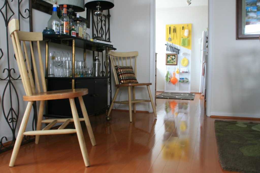
Our rental apartment, Sunny, is literally 3 rooms: kitchen, bedroom, living room (+1.5 bathrooms). The living room is big, and visually divided in half by a couch (actually more of a fancy futon from CB2). The living room got a cheap thrifty, DIY makeover this summer (see more here), but the dining room half needs help. The dining room half is divided into 2 areas, the kitchen table and this weird little nook… I call it the bar/chatting with the chef nook, and it is super desperate. It’s a hodge podge of random pieces, including the free bar (Andy collected a lot of freebies before I moved to FL).
A little background to fully understand what can and can’t happen with this nook:
- Wall can not be painted, I’m lazy, and I really don’t want to paint it back when we move. (Open to other ideas… electrical tape?)
- Mirror is from our Austin condo, it can be painted.
- Iron scrolls… Super undecided. I want them in my beautiful garden outside. Too bad that’s currently only in my imagination.
- Wooden chairs… Andy lived in the apartment for 6 months with out me, the one thing he bought with a small wooden table and 2 chairs, although he inherited a ton of freebies! The table is under the bed, the chairs have no home. Not to mention, it’s where you sit to talk to the chef 🙂 Totally open to painting? Or maybe I kind of like the blonde, mid- century modern look? Dipped feet?
- Black bar cart. It was one of the many “Poor Andy lives here all by himself with nothing” freebies from sweet people in our building. The black cart a little crusty, has a broken magnetic door, but it fits the space well, and is currently serving a purpose. (FYI: we really don’t drink that much. If you notice the bottles never change, ha!)
- Lamp and pillow can be moved or shoved in a closet.
- Budget= cheap. Paint it about all I want to buy : )
- Color. I’m not scared!
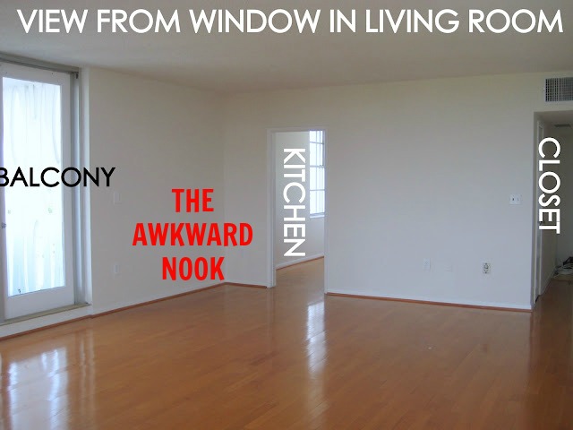
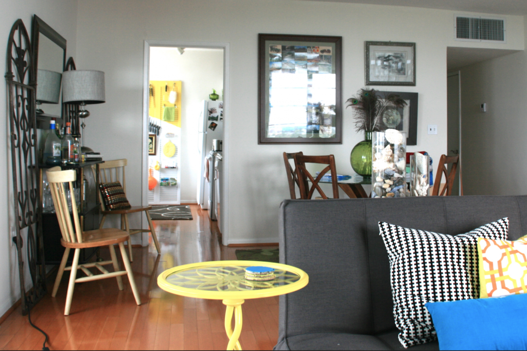
Here is the nook empty and from the living room side. (Here’s more pics of an empty Sunny):
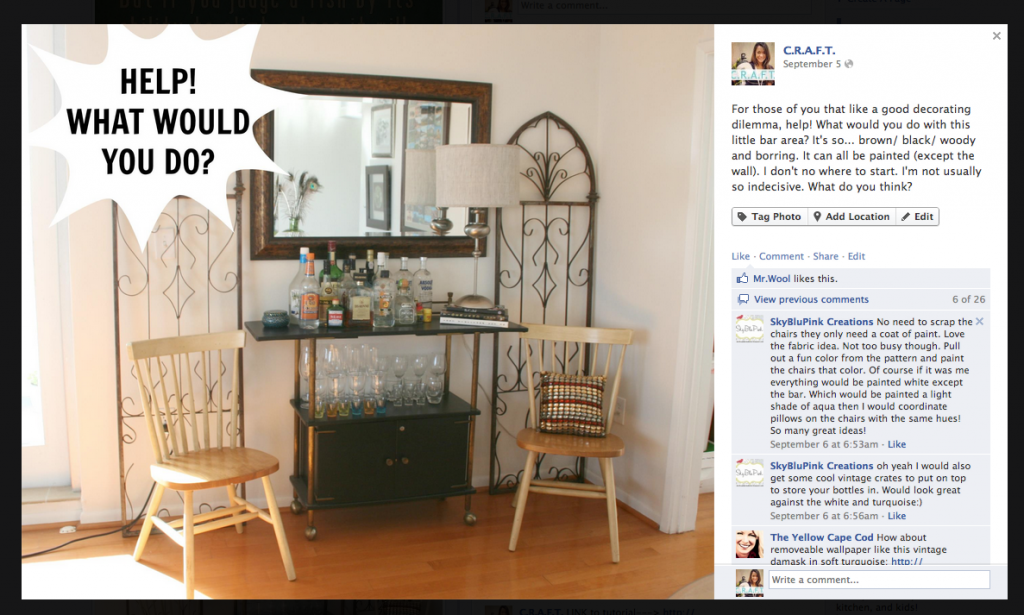
I asked my super smart C.R.A.F.T. facebook fans what they thought I should do, and I got a wide variety of answers (see all of them here). I like hearing other perspectives and ideas…
Here were some of their ideas that I really like:
- Debbie said, “Put a solid fabric behind the screens, will make them stand out more, pick a snazzy print for chair cushions, or buy some at the outdoor furniture section. Guild the mirror frame gold, and pop gold rivits in the lampshade.”
- Taylor said, “I think I would loose the chairs, and I think it needs some fabric and color, what if you found a cool tapestry from urban outfitters or a cool vintage sheet and stapled it to the wall, would look like wallpaper!”
- Ameryn said, “Paint the mirror and the bar. Leave the chairs!!! They are a great Scandinavian looking neutral! Maybe add new pillows to them, or make fun seat cushions! =) The scroll pieces behind are throwing me off.”
- Sarah said, “I would apply the removable wall paper to the entire wall, remove the chairs and screens and leave the bar cart and mirror.:)”
- Francine said, “No need to scrap the chairs they only need a coat of paint. Love the fabric idea. Not too busy though. Pull out a fun color from the pattern and paint the chairs that color. Of course if it was me everything would be painted white except the bar which would be a light shade of aqua then I would coordinate pillows on the chairs with the same hues!
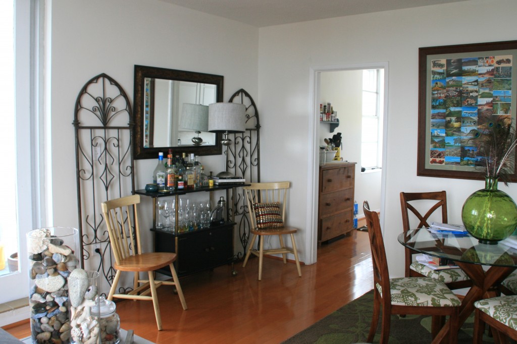
The living room half of the room is grey and white with pops of yellow, orange and turquoise.
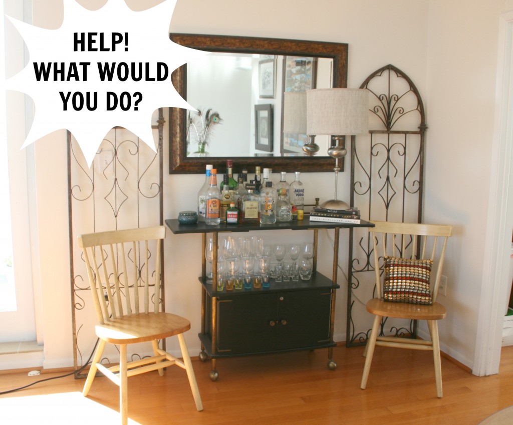
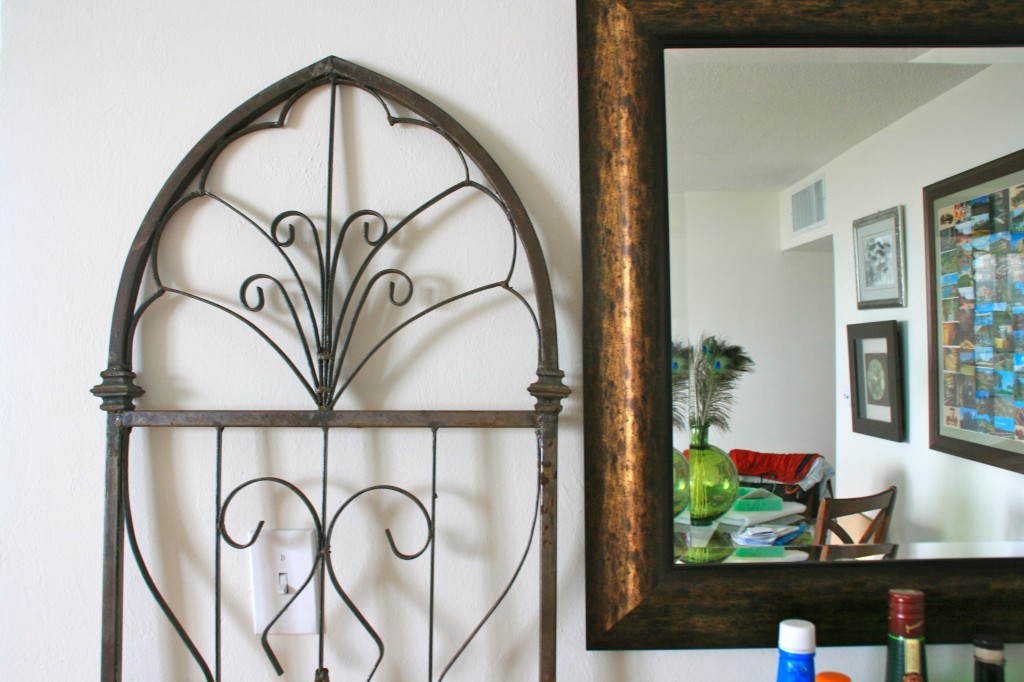
And here’s a close up of the current boring brown iron/ mirror combo:
So, what, what what would you do? (Anyone used to LOVE that show?)
Seriously though, I need help. Quick, what’s your first thought…

Comments & Reviews
Hi Jamie!
I agree it looks a little too symmetrical but it seems to serve a good purpose for you. I would recommend moving the bar cart over to the left (cover up the electrical outlet & lamp cord). Love the idea of dipping the chairs. I would paint the mirror the same color & hang it above the bar in the opposite orientation that is is now. Perhaps orange? Do you have the orange chair you blogged about in this same room? Then I would place the metal pieces in the corner and arrange the chairs in front of them.
That’s my two cents worth 🙂 Love your space & your blog post are always so creative!
Cheers!
-JoAnna
Well the first thing I would do is get those chairs out of there. It’s not that I don’t like them, but they seem like they take up too much space. Second, it looks too symmetrical. With the chairs and the iron panels flanking each side of the bar there’s not really a spot of interest. Knowing that it’s your chat w/ the chef area I would probably just have one chair at and angle. If you would like to add some color you could buy a piece of really thin plywood (think book case backing), paint it, and then tack nail it into place. Oh, and even though you said the bar was a little Crusty, I love it! It’s a great size for the space. Maybe a smaller lamp would be better, like a swag lamp? Good luck, by the looks of it you’ve got plenty of suggestions.
Nikki Kelly @ the ambitious procrastinator
I actually like your arrangement with the trellis. The light colour of the chairs is the only thing I would consider changing. Slip covers would be a great option if you think a future home will work with the blonde wood. Otherwise, I would paint them black or a metallic colour so they aren’t the focus when you look in that area. You have a lot of great colour in the room too, so turquoise would like great too.
I feel a bit mean saying this, but I hate the bar. I hate all the bottles and glasses on it too, it’s like a massive, unattractive dust collector. I think I agree with what someone else said, replace it with a thrifty dresser and hide all that glass or at least chop the top level off and paint it. Or maybe, depending on space, get rid of all of it and get a little cosy sofa if it would fit, or maybe a country style table for two and keep the chairs. Not sure about the mirror, but the ironwork I love. It might look nice if hung a bit higher and put one on the little side wall of that nook, and the other on the other side of the door so it looks like opened shutters? Maybe get rid of that big postcard framed artwork and other bits and put the mirror there.
I haven’t read all the comments yet…but I agree with the FB commenter who said to put fabric behind the screens. I am seeing something like a burnt-orange burlap or canvas…or a velvet/suede fabric. Something substantial in weight and/or texture to add richness.
I’d also lose the chairs. Even if you painted them, the style and placement just doesn’t go with the bar, mirror and screens. Just my opinion, of course. For “chatting with the chef” – how about stools in the kitchen?
The bar looks black and gold. I like it. How about painting the screens and mirror to match? Either paint screens black and mirror gold or vice versa…or paint both black and then add a distressed gold edge. You can do this with a paintbrush, hitting the faces lightly, or hit it with a little gold spray paint (my latest go-to and answer for everything). (If you do this, the fabric color behind the screens might have to be adjusted.)
Another cool way to add texture w/o a rug is to add a swag of fabric around the mirror – like a swag curtain or curtain sash – whatever you want to call it.
I would think the silver/pewter lamp would also have to be moved or painted gold if you’re doing the black/gold thing.
Since the bar looks so 60s to me – I’d say go with it.
Sorry this was so long. Surprised myself. Love your blog!
I think it’s too much going on in that little corner. The chairs don’t seem to fit. I would relocate them somewhere else. I like the mirror and the bar. I think it would look better if you could put the bottles on the bottom shelf and put the glasses in the bottom, then the top would be free. I don’t like everything out. I think the iron looks fine.
I like the idea of bottles on the shelf! Thanks!
OK, I would choose a color (maybe something like the reddish color in the pillow) and paint everything the same color: bar, chairs, mirror, and, if you have to keep it, iron work. If the red doesn’t jar with your cool colors of turquoise and gray. If it does, use turquoise. Then put the pilow back on the chair and enjoy your unified nook.
My first thought was that it was kind of bland. You always seem to have pops of color and this area is definitely needing some color.
I agree with other comments that the chair/scrolly thing combo is too much. It doesn’t seem that you can or want to get rid of either. I like the idea of hanging the iron scrolls. I wonder if it would look strange having them higher than the mirror. Also I wonder if you painted them a lighter color. closer to the color of the walls or with just a hint of color so they blend in better to reduce that busy feel.
I like the idea of a simple slipcover over the chairs. I like the lines of them but with the contrasting scroll I think it would tone it down to have them slip-covered. Of course if, you can make the scrolls blend better, I think painted chairs would add a nice pop of color.
And last, can you hide any of those bottles? I think fewer bottles would look more decorative, less clutter.
No matter what you do I look forward to seeing it.
Space is really limited here in Sunny 🙂 All those bottles make us look like alcoholics too, ha!
I think it’s mostly the scale of things that make it look awkward. The cart and the chairs look too small for the space and the scrolly panels are too low. Love the mirror, that’s the one thing I would not remove. You could change the color of it if need be. The scrolly panels need to be hung on the wall, they’re too low now and I think hot gluing a fabric on the back of them would calm them down, I’m thinking something close in color of the metal. I would remove the chairs or at least slip cover them to make them look comfier. The cart should be replaced by something with more substance (curbside or thrift store dresser serving as a buffet?). Those are free or at least cheap and all it takes is a coat of paint to match any color scheme and it could still hold your drinks etc. If you want to spend more then I think the wallpaper/fabric on the wall could add a lot of color/pattern, a large floor plant on the left and a pouf or a softer looking chair on the right. Just my two cents, there’s hope, though 🙂
good points! I’ve always got my eye on road side trash 🙂
First thought: Iron work needs to go. It’s too much.
I could see the electric tape (just orange) stripes on the wall – really cool idea by the way, I’m so dong the tape when we move. Bar server: black top and base w/ yellow poles. Paint the mirror frame black to match. Turquoise chairs with dipped feet – yellow and orange (so the progression down is turquoise, yellow, and orange at the bottom).
sadly, I agree 🙁 I just have no where else to put it right now, and I don’t want to get rid of it!
Ok, first thing: I think there is too much stuff for such a small space. I’d consider ditching the iron work or the chairs…maybe even both and replace the chair with a chic pouf so people can still “talk to the chef”. If you keep the chairs, I’d paint them or add some fabric chair cushions to give you some color.
Also, I would definitely paint the mirror. As is, I don’t think it blends with the scheme/vibe you have going in the living room area.
i agree… too much stuff. it seems to be a theme in our one bedroom apt! i just have big plans for those iron peices when I have a backyard garden one day 🙂
There’s a lot of different looks going on in the corner. I think you should focus on the look you like best or the functionality you want from that space. Personally, I’d ditch the chairs (they are lovely, but they seem awkward in this space to me). I’d make a poof and a large floor cushion (maybe 2) with bright fun colors. I’m undecided on the mirror but lean towards painting it a bright color (orange? gold?). I love the iron screens, but I think they compete a bit with the bar, so I might relocate them.
Maybe with wallpaper or fabric turn that nook into a modern kind of garden! That way you use the iron, but still have it in a garden, the way you want it… You could use the ideas that other people have mentioned and go with greens, which may even brighten up the nook.. =)